Monday, February 25, 2013

The Dark Mod FM Review: Winter Harvest

This is a review of one of The Dark Mod’s (a mod for Doom 3) fan missions. It may contain traces of spoilers. You have been warned.

Winter Harvest Author(s): Shadowhide
Version: 1.1
Date released: 2011-05-08
Other info: Seasons Contest ‘11 entry
Theme: Builder/Haunted/Pagan

From what I’ve learned, Shadowhide is well known for putting others down when it comes to their FMs, and was criticised for having not churned out an FM himself. So he took to doing just that, and even he will admit – it failed miserably.

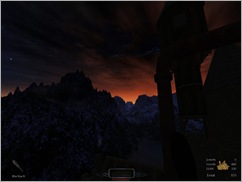
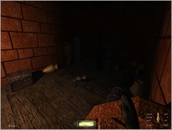
The layout isn’t all that good, and it took me a while, and with increased brightness and gamma settings, to find my way out of the first part of the initial map. In fact the lighting isn’t very good throughout the map – you have to rely on moonlight to get from place to place, or try and get a bead on the willow ‘o the wisp by the cemetery.

The atmosphere is sort of spooky, but the use of sound is dreadful. One sound is used over and over (which was supposed to be wind blowing through the trees) which made the spoken dialogue by characters barely audible. One good thing in this mission – and it was spoilt for the most part by some shoddy audio direction.

All the while I was expecting to come across a pagan or some animal of sorts in the forest, but that was a missed opportunity as well, as it is completely devoid of life apart from the two human characters – and you can’t even bump them off for fun seeing as you’ll fail a mission objective (“don’t hurt ever your friendlies”, or something to that effect). There could have been more care with spelling and grammar in some cases. I assume SH’s first language isn’t English. If it is, I pity him immensely.
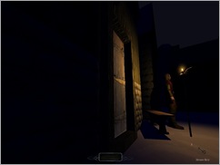
Got locked out of his house... again. The plot is a little thin, and it was hard to know what to do in some cases, as scripted sequences are badly programmed – such as when the haunt in the chapel (spoiler) is supposed to speak to you and tell you what to do next. If you don’t see it, then you’re on your own in figuring out the next part of the puzzle.

Basically you have to navigate your way around the map, open this, get this key, go here, put that object here before being inexplicably teleported somewhere else, and then another place. It’s too easy to get what you’re looking for in the first room of the stronghold, and too easy to escape. But I will say that this last place has some good ideas. The design is better, and there is more spoken dialogue without the annoying ambient noises getting in the way. There’s a glimpse of this FM’s potential – what could have been. There just aren't enough Builders or guards around the place, and the final boss battle is pathetic! Way too easy, or impossible to get past in some cases because the blighter took to hiding behind a wall.

Then getting back to the forest, once the curse of everlasting winter has been lifted, which was part of the storyline (this is a Seasons Content entry if you hadn’t noticed by now) it’s really an eyesore to see the forest in daylight. The Doom 3 engine wasn’t meant to handle this sort of thing, evidently. Another example is “Reap What You Sow” – this FM also looks pretty poor because it was set in the day. Textures look awful, the lighting is non-existent. Daytime missions don’t work in TDM, as far as I’m concerned.

This mission doesn’t play like you’d expect a TDM mission to. It’s more of an adventure, collecting inventory items and trading them for others. What could be done to save this FM in version 2.0 (which is actually out now at the time of writing this)? More AI characters, even creatures in the forest, some haunts in the cathedral, and just more of a challenge, overall. But I have come to the conclusion that although “Winter Harvest” might have had potential; promise at some points, it ended up being the worst TDM mission I’ve played so far to date. I’m not attacking the author personally, and I’m trying to remain unbiased, but I have to review this FM for what it is, and it’s not good. And that’s probably an understatement.

Pros:

+ Spoken dialogue

+ Level design isn’t too bad in some places

Cons:

- Terrible lighting and textures in the last daytime part of the mission

- Barely any challenge at all

- Confusing

FM score: 3/10
Wednesday, October 24, 2012

New TDM FMs released: Old Habits & WS1: In the North

Two new FMs were released for The Dark Mod this month. One of them is Old Habits, created by Obsttorte. The other one is of particular interest to me and is called WS1: In the North. WS stands for William Steele. This is the name of the protagonist, no doubt, and this is part 1 in a series of missions, much like Thomas Porter (Sotha) and Farrell (Thief’s Den).

I’ve seen William Steele on the list of upcoming missions for TDM for some time and am glad that the first one has finally been finished and put up for download.

You can get them both here in the missions section, as well as many more.

Wednesday, October 3, 2012

The Thief 2 v 1.19 Patch

I saw this last week somewhere. I can’t exactly remember where, but I think it may have been Sshock2.com, which has more frequent updates than say thief-thecircle.com.

In any case, it appears that some mysterious taffer who goes by the name of “Le Corbeau”, on a French language forum has been working on a version 1.19 patch for Thief 2, and not only that, but has a patch for System Shock 2 as well that upgrades it from v 2.3 to v 2.4. These are unofficial, mind you. It’s been 12 years or more since Thief II v 1.18 was released by LGS.

These patches introduce a whole host of new fixes, from graphics, textures and resolution to gameplay and AI – fixes which probably aren’t apparent to anyone right away when playing the game, but this patch does make the game easier to run on modern operating systems and hardware. There’s also an upgrade to the editor, DromEd, too.

This comes at an opportune time as I was just contemplating whether I really wanted to install Thief II and play it… again. I’m now leaning more towards yes more than ever. Not only because of the patch, but because of some mods and FMs that I’ve downloaded for the game as well recently.

There’s a thread over the TTLG forums where you can get download links for these unofficial patches.

Thursday, September 20, 2012

Two new TDM FMs

It’s been months, but finally there are two new TDM fan missions on TDM’s website available for download. One of these is Deceptive Shadows and the other Vengeance for a Thief.

Deceptive Shadows was developed by ShadowHide, who so far has the rather poor mission called “Winter Harvest” under his belt. It’s about 22 MB to download and sounds like it might be worth a try. It couldn’t be much worse than the aforementioned FM anyway. The short write-up provided by the author seems to indicate that it involves a Builder swiping the main character with a hammer.

Vengeance for a Thief is the other one, created by Sir Taffsalot. He collaborated with Bikerdude on “Let Sleeping Thieves Lie”. This one sounds as though it might be interesting as the player is thrown in jail and must escape. Now there are only really two or three jail-themed missions in the entire Thief series. Cragscleft in Thief: The Dark Project, Shoalsgate Station in Thief II: The Metal Age, and one that actually had Garrett in a cell, and that was Pavelock Prison in Thief: Deadly Shadows. The only FM for TDM I can think of that had a person start off in a jail cell behind bars would be Betrayal by FieldMedic.

Sunday, September 2, 2012

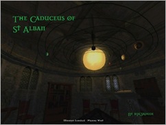
TDM FM Review: The Caduceus of St. Alban

This is a review of one of The Dark Mod’s (a mod for Doom 3) fan missions. It may contain traces of spoilers. You have been warned.

The Caduceus of St. Alban

Author(s): Bikerdude
Version Reviewed: 1.5.5
Date released: 2010-08-26
Other info: Summer Vertical Contest ‘10 entry
Theme: Builder

Bikerdude is likely the most prolific mapper when it comes to TDM. He’s made the most FMs out of all the authors that have churned out a mission in the last near three years since TDM’s original release. And while I wasn’t a fan of his FMs originally, I have since grown to like them.

Under the tutelage of Melan, he’s learned more than a few tricks, and just like his mentor, prefers to design city-based FMs, like “Business as Usual” or the excellent “St. Alban’s Cathedral”, with plenty to explore.

The Caduceus of St. Alban is the follow up to the aforementioned FM, and the scale with this one is somewhat smaller, but there’s no shirking when it comes to design. Caduceus was entered into the Vertical Contest of 2012, and it shows: great big spires that reach the sky, with plenty to climb, such as vines and pipes. It’s a veritable playground – on the outside anyway, with some fantastic atmospheric effects such as a low lying fog that hugs the ground.

On the inside there’s stairwells and lifts that take you to the several floors, which are broken up by the three or four spires – it can get confusing traversing from one to the other at first.

Nice view, just a bit too fake for my likingSee?The armoury. Not "amory".The cells area. Some good secret areas to be found here.

Hover mouse over pictures for captions, if available.

But Caduceus isn’t without its faults. For one, combing through the TDM forum thread dedicated to this FM, you would find that there are some bugs in the mission, such as unpickable doors that need a key, that actually can be picked in the first place. Entering the “spider caves” can leave you stuck. It’s very hard to get out once you’re down there, and you might be forced to cheat by noclipping out of there. Another minor thing here, but more care could have been used with spelling with some of the items you acquire in the mission. “Armoury” (or “armory” if you speak yank) – well this mission yielded yet a third way to spell or misspell this word: “amory”. And “quarters” was misspelled as well. Things I don’t like to see.

Personally I think the design, apart from getting a bit lost in the spires, is excellent – particularly on the basement levels where you’ll find the armoury. The layout is great, smoothly travelling from lifts to stairs, through dark, torch-lit corridors. Mind that your brightness is set high enough though, otherwise you might miss a few doors down there. It’s poorly lit, but what would you expect in a place like this? It fits. But seriously, lighting could have been a bit better down in the dungeon and lower levels.

Climbing up the pipe to the top where the water tower is (one of the alternate ways up to this level) was thrilling, but once I got there, to the top, I was a little disappointed, being greeted with both the water tower and the bell tower, which were mainly for decorative purposes and didn’t serve much purpose as far as I could tell. Not that it’s a bad thing. But the view from up there was. There was just a background, much like you would have expected to see in a title like Half-Life or Quake II (I suspect Bikerdude is influenced by such games with a more modern, industrial feel, when I look at other maps such as Yan’s Test – a conversion of a Quake 4 multiplayer map), and it betrayed that former sense of awe I had on the lower levels, as it showed a disconnectedness; a floating island in the middle of nowhere. I understand this was probably to prevent a performance hit, as there are all ready FPS drops in the mission as it is, so it’s probably more of a design choice.

Pros:

+ Awesome level design, layout

+ Plenty of interactivity with the environment (vines, pipes to climb)

Cons:

- Needed more proof reading, beta testing

FM score: 8.6/10

Wednesday, August 15, 2012

The Dark Mod FM Review: Lord Dufford’s

This is a review of one of The Dark Mod’s (a mod for Doom 3) fan missions. It may contain traces of spoilers. You have been warned.

More or less what I thought of this FM at first.

Author(s): stumpy
Date released: 2010-03-31
Theme: City/Mansion

When I played this fan mission for the first time, I hated it. Loathed it; despised it. Call it what you will.

Reading through the briefing, punctuated with spelling and grammatical errors, I didn’t hold out much hope for this one. And looking through the objectives didn’t make me feel much better. It felt silly. It read like a Monty Python sketch, and I knew that this mapper was probably just as “under the influence”.

Starting at one of the city gates, I headed off towards the area with the barrels on the one side of Dufford’s Castle, where the ale was delivered. This was one of the entry points. The objective is to find out what happened to the Lord who resided here, as a favour for one of his fellow noblemen. But I felt guilty about not having explored the rest of the perimeter, so I eventually went back and took a tour, doing a lap around this rather huge map. On the outside, the city looked good. Apart from a rather cheaply designed and lewd Inn sign, a bit of effort was put in, and I could feel the atmosphere, surprisingly.

Feeling more satisfied, I continued on in to the manor itself. This is where I started to gradually develop disdain for this FM. Overly large areas; needlessly wasted space; empty rooms without reward; plain textures; too much emphasis on lockpicking. Only a few minutes in, I went to the main menu, and uninstalled the mission, opting to play another instead.

But after having completed most of the other missions, a few weeks later, I came back. I always end up coming back and giving it another try, like a failed relationship.

A more out-of-the-way path across the massive well-lit halls.I wasn’t any more impressed with the level design, which looked somewhat unprofessional, and looked like it had been hurriedly pieced together without much forethought – sort of like a big box had been set down, hollowed out and rooms just placed in it in order to take up space. I’ve seen other mappers do a lot more with a lot less. There were some unique additions like the waterwheel, however. I’ll give that to this author – he does try out new approaches, even though he’s made only three FMs so far that I know of, the others being “The Illusionist’s Tower” and “House in Blackbog Hollow” – the latter being his best by far.

But there was a reason behind this incomplete feel given by the author, stumpy. This FM was not supposed to end up being released to the public – it’s more of a test level, and it shows. It could have used more polish, some proofreading, and a lot of beta testing, to say the least.

But once I started to focus on the story and the objectives and not on the flaws with the design, I started to get into it. Things really start picking up when you reach the first floor, and enter Chaz’s room. Out of all the rooms in the manor, this had the most appeal. This is where you start along the trail which will lead you from clue to clue so you can progress through the mission. The clues aren’t all that obvious and you’ll stumble across some by accident, but still.

Entering the sewers below the streets yielded some surprises, and upon getting back inside the manor, I started to understand why there was the need for such seemingly unnecessarily large areas. Because there’s a lot going on in the centre and underneath the manor. Plenty of secret rooms, hidden staircases, and vaults awaited. More than halfway through the mission, things were getting good, finally. And in the end, the story tied up quite nicely, with maybe one or two loose ends, inaccessible areas, and the promise of more to come. Nothing better than a few unanswered questions when all is said and done.

Lord Dufford’s bears similarities to another mission – and no, it’s not Lord Bafford’s Manor from Thief: The Dark Project, despite the name. LD tries to emulate what makes “Heart Of Lone Salvation” such a great FM, what with its plot twists, awesome storyline, and its unparalleled uniqueness; inventiveness. But it fell flat. I only really started to enjoy this FM more than halfway in, and that’s rather a shame, seeing as it had potential – great potential, but it just came out half-baked in the end.

Pros:

+ good effort on story, characters, fantasy writing.

+ plenty of secret areas and surprises.

Cons:

- level design, particularly those large, empty rooms. Those were an eyesore.

- needs more beta testing, polish.

FM score: 6/10

Monday, August 6, 2012

The Dark Mod FM Review: The Rift

This is a review of one of The Dark Mod’s (a mod for Doom 3) fan missions. It may contain traces of spoilers. You have been warned.

TDM

Author(s): Baddcogg
Date released: 2010-08-15
Other info:
Summer Vertical Contest ‘10 entry
Theme: Haunted/Underground

Starting off, this seems like just another “break in to a mansion and case the joint” kind of mission. You collect your thieving gear and get ready to exit via the window when you hear and feel a tremendous rumble coming from the earth.

As you drop down on to the street below, objectives change: forget going to some old doffer’s mansion – let’s investigate that hole in the ground instead. If you’re interested, you can still nip across the road and frob a few coins and gems from a table set outside some unpickable doors – this may or may not be the mansion you were going to visit this night. You’ll have to mind the guards and Builder along the way though.

So getting back to the rift that opened up after the earthquake: dropping down a bit, you’ll immediately notice that this must be a vertical contest 2010 entry. But instead of opting for the usual tower-based mission, Baddcogg went for an underground mission instead – a different way of looking at things, and it still counts, technically. You end up in some abandoned mines which have been sealed off for goodness knows how long, and it’s inhabited by bloody spiders. The big ones are especially brutish; the smaller ones don’t seem to be textured at all, they just appear grey – I don’t know if this is just on my PC, but I recall seeing some screenshots long ago that showed the same thing. In any case, spiders rarely crop up in TDM FMs, so it’s not a bad thing to see them here. You’re better off hacking them with your sword, although the big ones you might want to snipe with a couple of broadhead arrows.

A nice secret area.There are bugs in this FM, literally.There are zombies, too.About what you'd expect to find in an abandoned mine.

Hover mouse over pictures for captions, if available.

A bit farther down and you go beyond the mines and in to something akin to The Lost City from Thief: The Dark Project, except this is scaled down a bunch. It reminds me not only of Thief, but the better bits of Dark Messiah of Might And Magic as well. Within the building’s walls there’s a nice secret area or two to be found, and if you were worried at some point about not finding enough gems or gold to finish the mission, worry no more, for it is all here for you.

This mission isn’t easy to ghost. A lot of the light sources are inextinguishable, like crystals or mushrooms. Flaming zombies are less likely to notice that they’ve been doused than say, a guard with a torch, thankfully. The two occasions that I’ve played this mission, I ended up running for my life from the entry to the underground building, up the stairs and out again. I found being spotted by the zombies and spiders was therefore too common. The mission isn’t hard, but don’t expect to get a perfect stealth score without a lot of trial and error or patience. This is more Indiana Jones or Tomb Raider than your typical sneaking mission.

I was a bit disappointed not to find any belchers (you know what they’re really called). I was sure as I descended into the depths that I heard sounds that resembled these beasts. These ominous sounds did add a bit to the atmosphere and made me sit on the edge of my seat for a bit.

There are also some bugs – one game-breaking one that I should mention as well. After retreating from the mines on my first playthrough, I got back to the starting area and the mission didn’t end. I had to restart, tried a higher difficulty level, and got through. The only thing I did differently apart from changing the difficulty, was discover the one secret area.

Apart from all this, the mission’s not too bad. A bit on the linear side if not small, though, and involves simple backtracking to get out again. Perhaps a cave-in and having to find another route out would have been in order to make it a tad more interesting or challenging.

Pros:

+ Something a little different in theme.

Cons:

- Bugs

- Linear gameplay, and backtracking.

FM score: 7/10

Popular Posts